Dark Mode Support
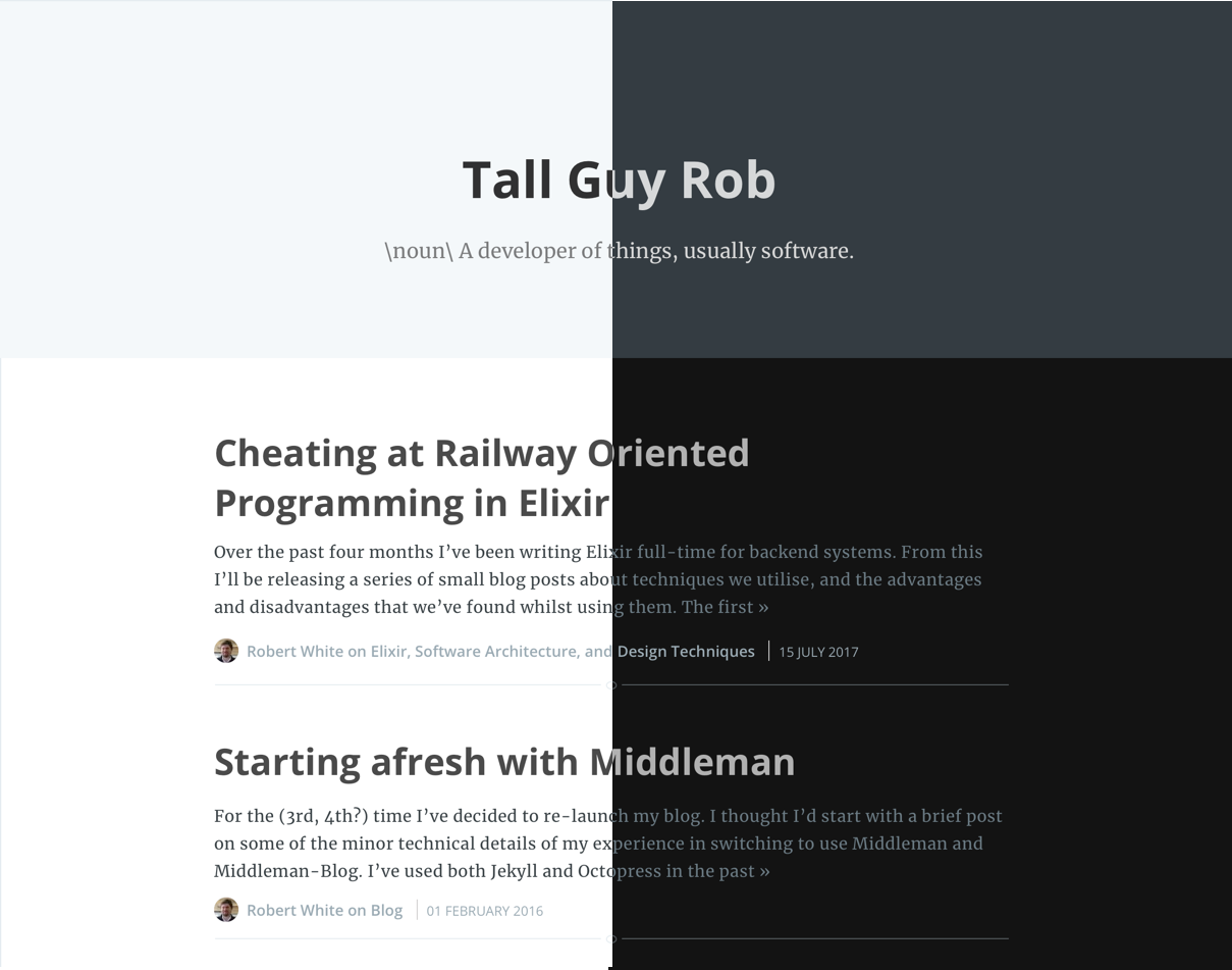
This blog post covers my addition of support for dark-mode OS setting as shown in the screenshot below. I am quite happy with the visual outcome, though I have yet to add a switch to manually set a preference for this site specifically.
The Inspiration
Inspired by the RefactoringUI, I decided to try to better understand aspects of visual design. After wracking my brain trying to think of what I could design/work on, I ended up setting myself a much more conservative goal of familiarising myself with Sketch by recreating my existing blog (which uses the Casper theme provided by middleman-casper).
Recreating the blog home-page was quite straight forward after picking up a few tricks from watching the RefactoringUI videos on Youtube. Having successfully recreated the blog, and tweaked some of the colours to improve readability/accessibility slightly (thanks to ContrastApp) I was hungry for the next step.
By great coincidence I heard a “ping!”, as the StackOverflow blog post email came through announcing Dark Mode support. I thought to myself “I can do that”, and quickly proceeded to try and figure it out for myself before reading the very good explanation of how Stack Overflow managed it.
Going Dark
Having a complete mockup of my home page made the next steps surprisingly straightforward.
Creating a colour pallette
First I had to extract a colour pallette of the general colours used throughout the theme. Some of the colours failed to meet the constrast requirements from ContrastApp, and probably due to my inability to appreciate the subtleties in some of the colour variance I also collapsed certain shades of grey used in my default theme to the following:
Playing around with altering these select values in Sketch I came up with the following dark-mode pallette:
Extracting values to variables
I then extracted the usage of these colours into CSS variables as shown below:
:root {
  --color-background: #FFF;
  --color-highlight: #F5F8FA;
  --color-header-default: rgba(0, 0, 0, 0.8);
  --color-header-secondary: rgba(0, 0, 0, 0.5);
  --color-header-inverted: rgba(255,255,255,0.8);
  --color-text-default: #3A4145;
  --color-text-light: #848C93;
  --color-text-bold: #2E2E2E;
  --color-text-active: #111;
  --color-text-secondary: #222;
}

/* Example usage: */
body {
  color: var(--color-text-default);
}
Dark-mode variable overrides
Now that we have extracted our colour pallette into variables (and selected out colour pallette for dark-mode), we just need to override the variable values on detecting that the OS is using dark mode. To do that we use the prefers-color-scheme media query:
:root {
  --color-button: rgba(255, 255, 255, 0.8);
  --color-background-code: #131313;
  --color-text-code:  #d0d0d0;
}

@media (prefers-color-scheme: light) {
  :root {
    --color-background: #FFF;
    --color-highlight: #F5F8FA;
    --color-header-default: rgba(0, 0, 0, 0.8);
    --color-header-secondary: rgba(0, 0, 0, 0.5);
    --color-header-inverted: rgba(255,255,255,0.8);
    --color-text-default: #3A4145;
    --color-text-light: #848C93;
    --color-text-bold: #2E2E2E;
    --color-text-active: #111;
    --color-text-secondary: #222;
  }
}

@media (prefers-color-scheme: dark) {
  :root {
    --color-background: #131313;
    --color-highlight: #353c41;
    --color-header-default: rgba(255, 255, 255, 0.8);
    --color-header-secondary: rgba(255, 255, 255, 0.5);
    --color-header-inverted: rgba(0,0,0,0.8);
    --color-text-default: #75828B;
    --color-text-light: #848C93;
    --color-text-bold: #B1B1B1;
    --color-text-active: #848C93;
    --color-text-secondary: #ddd;
  }
}
Final Tweaks
The final change I made as part of supporting dark mode was to change my default code-formatting styling from a light background to a dark background. I found this to be the simplest change that would look good on both a light-themed, and dark-themed setup. I found a dark code block on a white background less jarring than the inverse. As I use middleman-syntax, the change was as straight forward as:
- <%= Rouge::Themes::Base16.mode(:light).render %>
+ <%= Rouge::Themes::Base16.mode(:dark).render %>
Whilst I was making changes to the styling and HTML of the blog any way, I also included some additional accessibility fixes highlighted by the Lighthouse Audit tool.
And that’s it! This blog now has dark-mode support for users who have configured their operating system theme.
Thank you for reading!